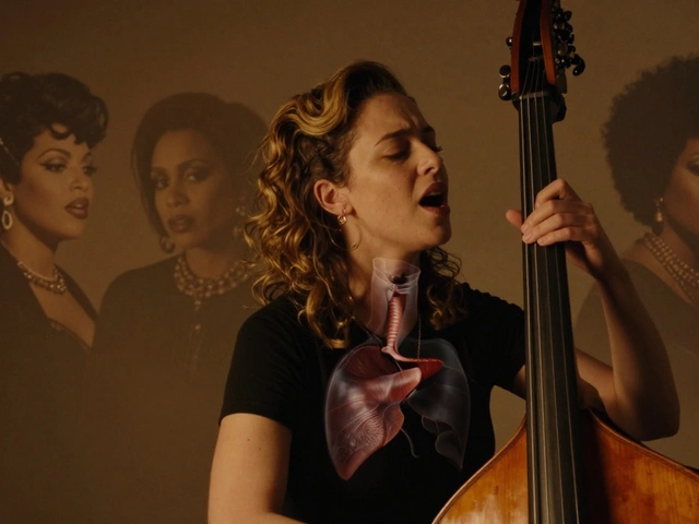
Imagine scrolling through your feed. You see a photo of Alli Starr is an independent artist known for blending folk storytelling with modern production aesthetics. The colors are muted earth tones. The caption uses short, poetic sentences. Now, you click her website. Same palette. Same tone. No jarring shift in identity. That seamless experience isn’t accidental; it’s the result of rigorous cross-platform branding. For musicians, this consistency is the difference between being remembered and being forgotten in a crowded digital landscape.
The Core Problem: Fragmented Digital Identities
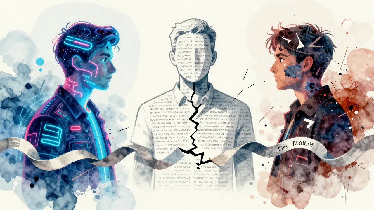
Most artists struggle with what we call "platform drift." On Instagram, they might post high-energy, neon-lit content to fit the algorithm. On their website, they present a minimalist, text-heavy bio. On TikTok, they’re dancing to trending sounds. While each platform has its own culture, the core brand message often gets lost. Fans feel like they’re following three different people rather than one cohesive artist. This fragmentation dilutes trust. If your visual language changes drastically from one touchpoint to another, your audience subconsciously questions your authenticity. They wonder which version of you is the "real" one. The goal is not to copy-paste identical content everywhere, but to maintain a recognizable thread that connects all your digital presence.
Defining Your Visual DNA
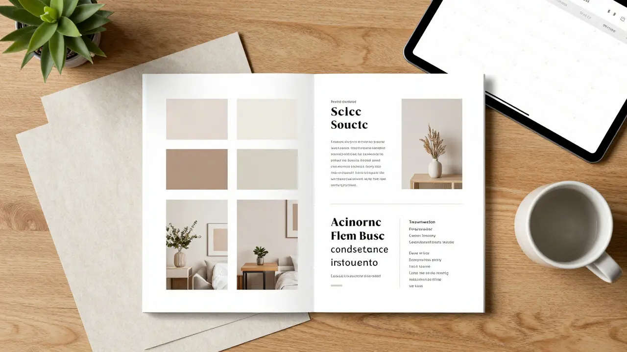
Visual consistency starts before you pick up a camera or open a design tool. It begins with defining your visual DNA. This includes your color palette, typography, photography style, and even the mood of your imagery. Let’s look at a practical example. Suppose your brand revolves around "organic growth" and "intimacy." Your visual DNA might include:
- Color Palette: Warm neutrals, soft greens, and cream whites. Avoid harsh blacks or electric blues.
- Typography: Serif fonts for headlines (feels traditional, literary) and clean sans-serifs for body text (readable on mobile).
- Photography: Natural light, shallow depth of field, candid moments rather than posed studio shots.
- Graphics: Hand-drawn elements or textured paper backgrounds instead of sleek vector lines.
Standardizing Your Artist Voice
Voice is just as critical as visuals. Your writing style across captions, emails, and website bios should sound like *you*, but consistently so. Do you use contractions? Are you formal or casual? Do you use emojis sparingly or liberally? Define your verbal fingerprint. For instance, if your brand is "thoughtful and reflective," avoid slang and exclamation points. Use complete sentences and thoughtful pauses. If your brand is "high-energy and fun," keep sentences short, punchy, and playful. A common mistake is letting the platform dictate the voice entirely. Yes, Twitter (now X) favors brevity, and LinkedIn favors professionalism. But your underlying personality shouldn’t change. A musician who is introspective on their blog shouldn’t suddenly become a hype-man on Instagram unless that’s part of a specific campaign. Instead, adapt the *format* while keeping the *tone*. An introspective artist can write a long-form thought on their blog and then summarize that same thought into a concise, meaningful quote for Instagram. The core sentiment remains the same, preserving voice consistency.
Practical Tools for Consistency
You don’t need expensive software to maintain this discipline. Here are some accessible tools that help streamline the process:
- Canva Templates: Create master templates for your most common posts (e.g., song announcements, behind-the-scenes photos). Save them as brand kits. This ensures fonts and colors are always correct.
- Grammarly or Hemingway Editor: These tools help maintain a consistent reading level and tone. Set your preferred grade level and stick to it.
- Content Calendar: Use a spreadsheet or app like Trello to plan content across platforms. Seeing your week’s content side-by-side helps spot inconsistencies before you publish.
- Brand Assets Folder: Keep a dedicated folder with your logo files, font downloads, and approved color codes (HEX/RGB values). This eliminates the "which blue did I use last time?" dilemma.
Measuring the Impact of Consistency
How do you know if your efforts are working? Track engagement rates, not just follower counts. Platforms reward consistency by showing your content to more of your existing audience. If your visual and voice are consistent, your followers recognize you instantly, increasing the likelihood they’ll stop scrolling and engage. Monitor metrics like:
- Click-Through Rate (CTR): Does your website traffic increase when you post visually consistent content?
- Email Open Rates: Do subscribers open your emails because the subject line and preview text match your usual tone?
- Follower Growth Quality: Are new followers staying engaged, or do they unfollow quickly? Inconsistent branding often leads to higher churn rates.
Common Pitfalls to Avoid
Even seasoned marketers stumble here. Watch out for these traps:
- Chasing Trends Blindly: If a trend doesn’t fit your brand, skip it. Better to be ignored than misaligned.
- Inconsistent Hashtag Strategy: Use a mix of branded and niche hashtags, but ensure they reflect your core themes. Random popular tags dilute your discoverability within your specific community.
- Neglecting the Website: Many artists treat their website as an afterthought. It’s your home base. Ensure it aligns perfectly with your social media aesthetic. If your Instagram is vibrant and colorful, a stark black-and-white website creates cognitive dissonance.
- Over-Automating: Scheduling tools are great, but don’t let them make your content feel robotic. Always review scheduled posts to ensure the tone feels human and authentic.
What is the first step in creating a consistent cross-platform brand?
Define your core values and visual/verbal guidelines. Before posting anything, write down your color palette, font choices, and tone of voice. This document becomes your reference point for all future content decisions.
Does every platform need to have the exact same content?
No. Each platform has different user expectations. However, the underlying brand identity-colors, tone, and core message-should remain consistent. Adapt the format (e.g., video length, text length) to fit the platform, but keep the soul of the brand intact.
How often should I update my brand guidelines?
Review your guidelines quarterly or whenever you launch a major new project, such as a new album or EP. Small tweaks are fine, but drastic changes should be phased in gradually to avoid confusing your audience.
What if my brand evolves naturally over time?
Evolution is natural. The key is to manage the transition. Introduce new elements slowly. For example, if you’re shifting from dark to light aesthetics, start with one accent color or a single typeface change. Communicate the shift to your audience so they understand the intent behind the change.
Is hiring a designer necessary for visual consistency?
Not necessarily. With tools like Canva and Adobe Express, many artists create professional-looking, consistent content themselves. However, if you lack design skills or time, investing in a freelancer for template creation can save you significant effort in the long run.