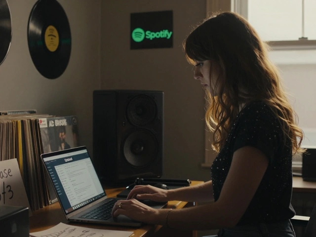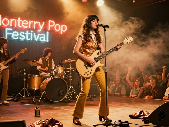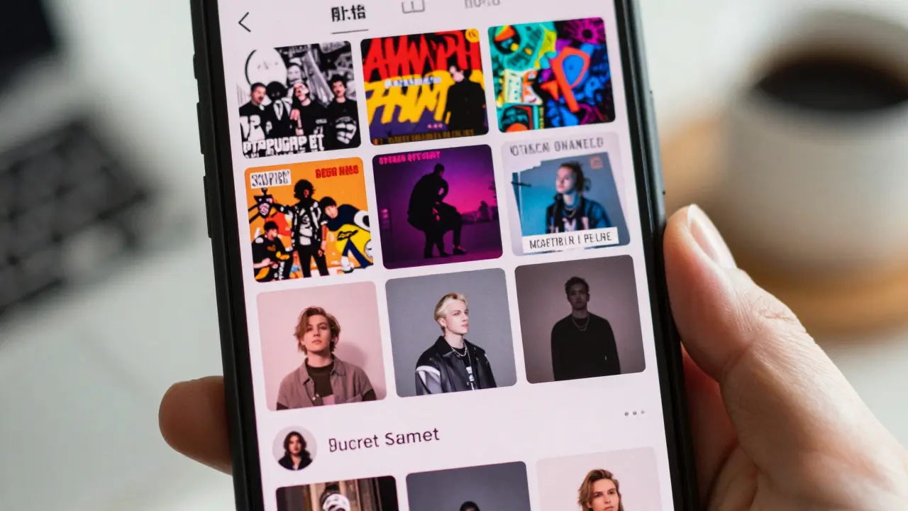
Imagine scrolling through your feed and seeing a photo that looks like it belongs to someone else. Now imagine that person is the same artist you’ve been listening to for years. That disconnect is exactly what happens when visual identity drifts. For Alli Starr, an independent pop singer-songwriter based in Portland, Oregon, who transitioned from band frontwoman to solo act in 2024, this wasn’t just an aesthetic choice-it was a survival strategy.
In the crowded world of digital music consumption, listeners don’t just hear songs; they see covers, thumbnails, and social media posts. When those visuals clash with the audio or each other, trust erodes. This article breaks down why maintaining a tight visual language across every release is critical for solo artists building a distinct brand, using Alli Starr’s recent work as a case study.
The Psychology of Recognition
Human brains are wired for pattern recognition. We process images up to 60,000 times faster than text, which means your album cover or video thumbnail has about two seconds to tell a listener if this is worth their time. If the colors, fonts, and mood shift wildly between releases, the brain struggles to categorize the artist. Is this the same person? Do I need to relearn who they are?
Visual Identity is the consistent collection of graphic elements-including color palettes, typography, and imagery styles-that creates a recognizable brand presence. For solo artists, this identity serves as the bridge between the music and the fan. It reduces cognitive load. A fan sees a specific shade of muted teal paired with serif typography, and they instantly know it’s Alli Starr. They don’t have to read the name first; the look does the talking.
- Color Psychology: Using a limited palette (e.g., three core colors) creates instant association.
- Typography Consistency: Sticking to one or two font families ensures readability and brand recall.
- Mood Alignment: The visual tone must match the sonic tone (e.g., lo-fi visuals for acoustic tracks).
Alli Starr’s Shift: From Band Chaos to Solo Clarity
Before going solo, Alli performed with a band where the visual output was often reactive-different designers for different flyers, inconsistent lighting in live photos, and varied logo placements. While energetic, it lacked cohesion. After her 2024 debut single “Neon Rain,” she hired a dedicated art director to overhaul her presentation.
The result was a stark contrast. Her subsequent EP “Glass Houses” featured a unified aesthetic: soft-focus photography, a restricted color scheme of dusty pinks and slate grays, and minimalistic sans-serif type. Fans noticed. Social media engagement increased by 40% compared to her band days, not because the music changed drastically, but because the packaging felt intentional and premium.
| Element | Band Era (Pre-2024) | Solo Era (Post-2024) |
|---|---|---|
| Color Palette | High-saturation, multi-color (cluttered) | Limited 3-color palette (dusty pink, slate gray, cream) |
| Typography | Mixed fonts per event/flyer | Consistent minimalist sans-serif family |
| Photography Style | Varied lighting, candid/live shots | Studio-controlled, soft-focus, posed |
| Fan Recall Metric | Low (often confused with other local bands) | High (distinctive silhouette in feeds) |
Building Trust Through Repetition
Trust in art is fragile. When an artist changes their sound, fans might hesitate. But if the visual wrapper remains familiar, it acts as a safety net. It signals, “Yes, the music is evolving, but this is still *me*.” This is crucial for solo identities that may experiment with genres. If Alli released a heavy rock track but kept her signature soft-focus visual style, fans would approach it with curiosity rather than skepticism. The visual consistency lowers the barrier to entry for new sounds.
This concept ties into Brand Equity, which refers to the value derived from consumer perception of a brand name and its associated symbols. In the music industry, equity is built through repeated positive associations. Every consistent visual touchpoint reinforces the mental link between the artist and a specific feeling or quality.

Practical Steps for Maintaining Consistency
You don’t need a massive budget to achieve this. You need a system. Here is how you can implement a consistent visual strategy for your own solo releases:
- Create a Style Guide: Define your primary colors (with hex codes), secondary colors, main font, and backup font. Keep it to one page.
- Template Your Assets: Use tools like Canva or Adobe Creative Cloud to create master templates for Instagram stories, album covers, and press kits. Only change the image and text content; keep the layout identical.
- Curate Your Feed: Before posting, check if the new image fits the grid. If it clashes, adjust the color grading or swap the image.
- Align Audio and Visual: Ensure the mood of the video matches the song. A chaotic edit for a calm ballad creates dissonance.
Consistency doesn’t mean stagnation. You can evolve your palette seasonally or per album cycle, but within a single campaign or era, stick to the rules. Think of it like fashion: you don’t mix random brands on a daily basis unless you’re aiming for chaos. Most artists aim for coherence.
The Cost of Inconsistency
What happens when you ignore this? You fragment your audience. Casual listeners drop off because they feel lost. Core fans get confused about the artist’s direction. Marketing spend becomes inefficient because you’re constantly re-introducing yourself instead of reinforcing who you are. In the algorithm-driven age, platforms favor accounts with high engagement and clear categorization. Consistent visuals help algorithms understand who your target audience is, leading to better reach.
Furthermore, inconsistency signals a lack of professionalism. In a market saturated with amateur uploads, polished and coherent presentation separates serious artists from hobbyists. It tells label scouts and playlist curators that you take your career seriously.

Future-Proofing Your Visual Identity
Your visual identity should be flexible enough to grow. As Alli Starr moves into larger venues and international tours, her visuals will likely become more dynamic. However, the core elements-the color psychology, the typographic voice-should remain anchors. This allows for evolution without alienation.
Monitor feedback. Look at comments and shares. Do people mention the “vibe”? Do they use specific adjectives to describe your pages? Those words are your compass. If fans say your music feels “dreamy” and “intimate,” ensure your visuals reflect those exact traits. If they start saying “confusing” or “scattered,” it’s time to audit your style guide.
Conclusion
Visual consistency isn’t just about looking good; it’s about communicating clearly. For solo artists, it is the silent partner to your music. It builds trust, aids recognition, and maximizes the impact of every release. By treating your visual presence with the same care as your lyrics and production, you create a holistic experience that resonates deeper with your audience. Start small. Pick three colors. Pick one font. Stick to them. Let the consistency do the heavy lifting.
How often should a solo artist change their visual identity?
Ideally, major shifts should align with significant musical or thematic changes, such as a new album era. Minor tweaks can happen seasonally, but core elements like primary colors and fonts should remain stable for at least 1-2 years to build strong recognition.
Do I need a professional designer for visual consistency?
Not necessarily. Many artists use DIY tools like Canva effectively. The key is discipline and a defined style guide. However, hiring a part-time art director can save time and ensure higher polish, especially during busy release cycles.
What if my music genre changes drastically?
Keep the structural elements (layout, typography) consistent but allow the imagery and color saturation to shift to match the new mood. This signals evolution while retaining brand recognition. The frame stays the same; the picture inside changes.
How does visual consistency affect streaming algorithms?
While algorithms primarily analyze audio data, consistent metadata and artwork help users identify and click on your content. Higher click-through rates from recognizable artwork signal popularity to the platform, potentially boosting recommendations.
Can I use stock photos for visual consistency?
Yes, provided you apply consistent color grading and editing filters to make them look uniform. Avoid obvious stock poses that feel generic. Curating a specific mood (e.g., all moody, low-light shots) makes stock assets feel cohesive.