Imagine scrolling through a music feed and instantly recognizing an artist’s work before you even read the name. That split-second recognition is the power of design continuity. For rising artists like Alli Starr, maintaining this visual thread isn’t just about aesthetics; it’s a strategic tool for building a loyal fanbase in a crowded digital landscape.
Many musicians treat their album covers as isolated projects. They hire a designer, pick a color palette that looks good today, and move on. But when the next single drops with a completely different vibe, fans feel a subtle disconnect. Alli Starr avoids this trap by treating her entire discography as a single, evolving narrative. Her approach bridges the gap between raw creative expression and professional brand architecture.
The Core Philosophy of Visual Cohesion
Alli Starr is an independent musician and visual artist who integrates graphic design principles into her music releases to create a unified brand identity. Unlike traditional pop stars who rely on major label marketing teams, Starr manages her own visual output. This hands-on control allows her to ensure that every pixel serves a purpose.
Design continuity means using consistent elements across all touchpoints. For Starr, this includes specific typography choices, recurring color palettes, and thematic motifs that evolve rather than disappear. When a fan sees a new release, they aren’t confused by a sudden shift in style. Instead, they recognize the progression. It feels like turning pages in a book they’ve been reading for years.
- Consistent Typography: Starr uses a custom serif font family for all title treatments. This creates an immediate visual anchor.
- Evolving Color Palette: While the base tones remain warm earthy hues, each album introduces one new accent color to signify growth.
- Recurring Motifs: Abstract geometric shapes appear in her live show backdrops, merchandise, and social media graphics.
From Concept to Canvas: The Workflow
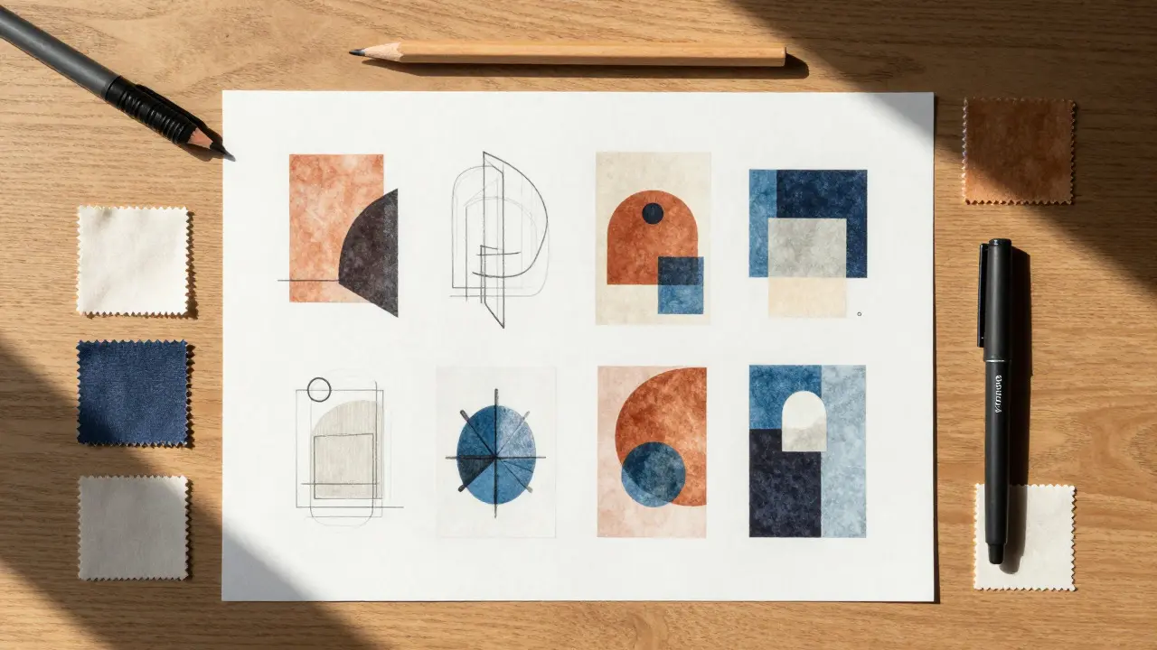
How does an artist actually execute this? It starts long before the recording sessions end. Starr begins her visual planning during the songwriting phase. She sketches mood boards that reflect the emotional tone of the lyrics. If a song deals with isolation, the visuals might feature negative space and cool blues. If it’s about connection, the designs become denser and warmer.
This pre-production step ensures that the final artwork isn’t an afterthought. It’s part of the artistic statement. Once the songs are recorded, she works with a small team of designers to translate these sketches into high-resolution assets. The goal is to produce a "visual treatment" document that guides everything from the vinyl sleeve to the Instagram story templates.
- Mood Boarding: Create a central visual theme based on the album’s lyrical themes.
- Asset Creation: Design the primary cover art, lyric videos, and promotional banners.
- Application: Apply the same design language to physical merch and digital platforms.
- Review: Check for consistency across all channels before launch.
Why Cover Art Matters More Than Ever
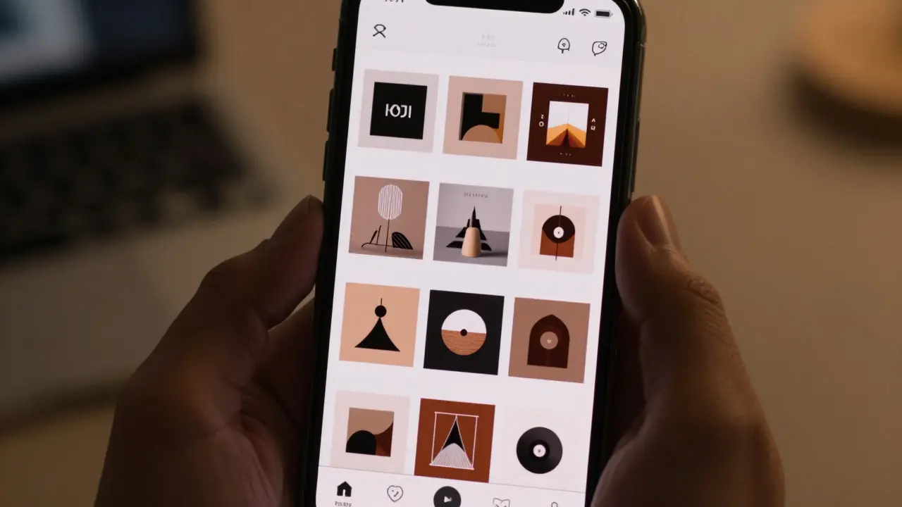
In the streaming era, cover art is often the first thing a listener sees. Spotify, Apple Music, and YouTube all display thumbnails in small grids. If your artwork doesn’t stand out or look familiar, you lose the click. For independent artists, this thumbnail is their storefront window.
Alli Starr understands that cover art functions as both a hook and a badge of authenticity. A cohesive series of covers tells fans that the artist cares about detail. It builds trust. Fans are more likely to buy merchandise or attend shows if they feel connected to the artist’s broader aesthetic world. It transforms a transactional purchase of a song into an investment in a brand experience.
| Strategy Element | Isolated Approach | Continuous Approach (Starr Model) |
|---|---|---|
| Brand Recognition | Low; requires constant re-introduction | High; instant identification via visual cues |
| Fan Loyalty | Transactional; based on single hits | Emotional; based on ongoing narrative |
| Production Cost | Variable; higher per project due to lack of system | Predictable; lower marginal cost for subsequent releases |
| Merchandise Sales | Inconsistent demand | Higher demand due to collectible nature |
The Role of Digital Platforms in Brand Building
Digital platforms amplify the impact of design continuity. On social media, a consistent visual grid makes an artist’s profile look professional and curated. Algorithms also favor accounts with high engagement, and strong visuals drive that engagement. When Alli Starr posts behind-the-scenes content, the editing style matches her album art. This reinforces the brand message without saying a word.
Furthermore, digital distribution allows for easy updates. If a new single is released, the cover art can be swapped across all streaming services simultaneously. Because the design language is consistent, the switch feels seamless to the audience. There is no jarring change in branding, which keeps the momentum going.
Practical Tips for Independent Artists
You don’t need a massive budget to implement design continuity. You just need discipline. Start by defining three core visual elements: a font, a color scheme, and a signature graphic element. Use these across every release. Don’t try to reinvent the wheel for every single. Let the details evolve, but keep the foundation solid.
Consider creating a simple style guide for yourself or your collaborators. Document the hex codes for your colors, the names of your fonts, and the rules for your logo usage. This document becomes the backbone of your brand. It ensures that even if you hire different designers for different projects, the final output remains recognizable.
- Define a primary and secondary color palette.
- Select one main font for titles and one for body text.
- Create a reusable template for social media posts.
- Archive all past designs to track evolution over time.
Building Long-Term Value Through Consistency
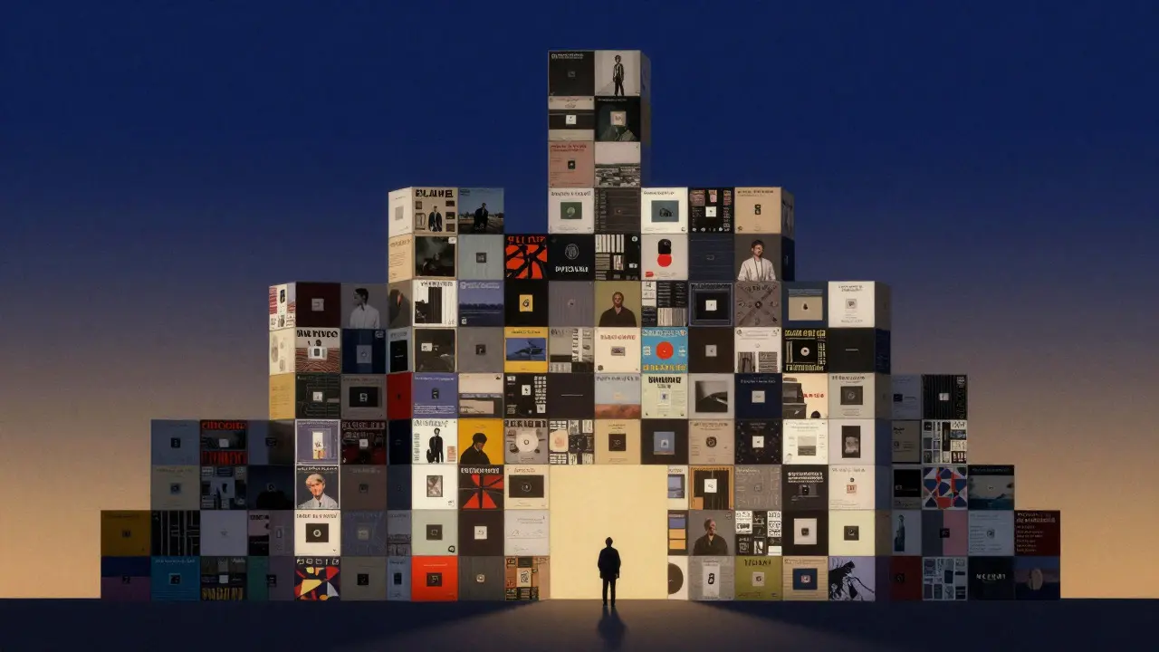
Brand building is a marathon, not a sprint. The value of Alli Starr’s approach lies in its compounding effect. Each new release adds another brick to the wall of her brand identity. Over five or ten years, this results in a formidable presence that competitors find hard to replicate. It’s not just about looking good; it’s about being memorable.
For any artist looking to grow, the lesson is clear. Treat your visual identity with the same seriousness as your musical composition. Your cover art is not just decoration; it’s a core component of your storytelling. By maintaining design continuity, you give your fans a reason to stay, a reason to return, and a reason to believe in your journey.
What is design continuity in music?
Design continuity refers to the use of consistent visual elements, such as colors, fonts, and motifs, across an artist's various releases and marketing materials to create a unified brand identity.
Why is cover art important for independent artists?
Cover art serves as the primary visual identifier for a song or album on streaming platforms. It helps artists stand out in crowded feeds and builds brand recognition, leading to higher click-through rates and fan loyalty.
How can I start implementing design continuity on a budget?
Start by choosing a limited color palette and a consistent font. Create a simple template for your social media and stick to it. As your budget grows, you can invest in more complex illustrations or photography while keeping the core elements intact.
Does design continuity limit creative freedom?
Not necessarily. Consistency provides a framework within which creativity can flourish. Think of it as a set of rules for a game; they provide structure, but the moves you make within them can still be innovative and surprising.
How often should an artist update their visual brand?
It depends on the pace of releases. Generally, minor tweaks can happen with each single, while a significant overhaul might coincide with a major album cycle. The key is to ensure changes feel like evolution, not revolution.